This post is about the desktop view only. The mobile view isn’t affected by this potential change and has separate considerations.
Looking at the Categories page, which is the default view for new users, I’m not sure we’re putting our best foot forward. I’m excited that people can finally find all of our categories without having to discover the Forum Index. But the right-hand side shows the latest threads, which are disorganized. So I’d like to consider a few alternatives. There’s a poll at the bottom of this post if you want to give feedback.
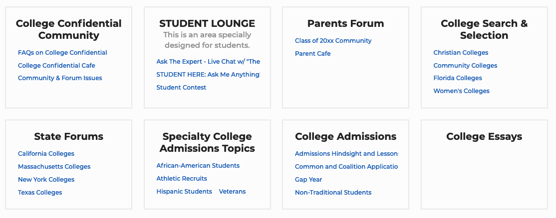
This version includes any pinned posts and threads with recent replies. It helps people know what sort of topics you might find in each category by giving examples.
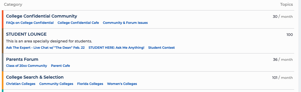
This is what we have now. The main advantage is it occasionally surfaces threads from categories that don’t get much notice otherwise. But it will be mostly dominated by a few very active threads.
Poll
Which design do you prefer?
Categories and subcategories only
Categories with featured threads
Categories and subcategories in boxes
Categories with latest posts on the right
0voters
Please also let me know in a reply why you like (or dislike) particular options. Most likely this won’t be the final design for the page. We’d like to explore other ways of showing categories that are relevant to users. For instance, if a student is applying to a school, they should see that school near the top of the list. So this poll is mostly to help me figure out what makes sense for the immediate future while our developers are working on more pressing issues.
One-thousand percent prefer the first option (categories & subcategories only). 2 and 4 are too busy and confusing if you’re new to it, with the two different sets of data on the left- and right-hand sides, and I’m just not a fan of the boxes. I’m expecting a list of categories.
The one thing that would improve #1 (to me, at least) would be if you could list the subs one per line, and show additional info like latest post/poster/timestamp/number of unread threads for each. Maybe with an option to collapse, especially for the categories with huge numbers of subs like Colleges and Majors.
I like the boxes. It’s more visual. One thing I liked on the other platform was the featured and AMA threads, which were clearly displayed and very visual. They grabbed the attention and were easy to find. I prefer the boxes because they aren’t just a wall of words.
I think the option to collapse is critical for that to work. Especially the school forums, which are huge. But this is future work, I’m afraid. The prebuilt options are somewhat limited.
I should note that the boxes don’t look quite so good when there are tons of subcategories or none. Notice the College Essays in my screenshot looks a bit lonely. The school forums just go on and on forever, if I’d taken a screenshot of the bottom of the list. Not the worst thing, but it is a bit on the odd side.
I’m sure I could get used to the boxes if that’s the consensus, but I have to say, I participate in a handful of forums and occasionally visit several others, and I’ve never seen the main forum index presented as anything other than a list. Boxes just don’t seem intuitive to me as a main index of what’s available. Maybe I’m just behind the times
Not at all! There’s even a preference for going to Latest instead of Categories. But it’s important for people new to the site to see what sorts of categories are available.
I like the boxes visually but where do you plan to list the colleges alphabetically? My concern is that new members will default posting all UC and CSU questions in the California Colleges forum. If you go that forum, the vast majority of post are moved.
I’m another boxes fan. It’s really easy and clear vs having to take more time to look at things. I can find exactly what I want and see what other options are there with no effort.
Can you do a mix and use the boxes up top for the categories that fit well into them and lower down list the individual colleges since they don’t really fit into a box?
I like 1 and 4. Number 1 is the cleanest but I’ve gotten used to number 4 and like the extra info. Definitely NOT boxes! Give me a quick list to peruse. Boxes are a real pain and make no sense to me.
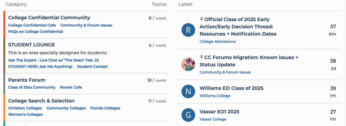
I prefer the categories on the left and the recent topics on the right because its easier to find information without having to open and move and hunt and peck. It may be a little busier but it gives WAY more information without having to search, makes it easier to select what one might want to read and requires way fewer clicks (which the advertisers may hate but the readers like).
Editing to add: I would like to see the category list on the left and the last post for that category across from it on the right. That would be very helpful.
The “Categories with featured threads” option got just 10% of the vote and the other three options almost exactly split evenly. The “Categories and subcategories in boxes” turns out to be technically unfeasible because we have a few categories with many subcategories. So for the moment, we’ve decided to stick with the “Categories with latest posts on the right” option. Thank you for your input! It’s been very helpful.