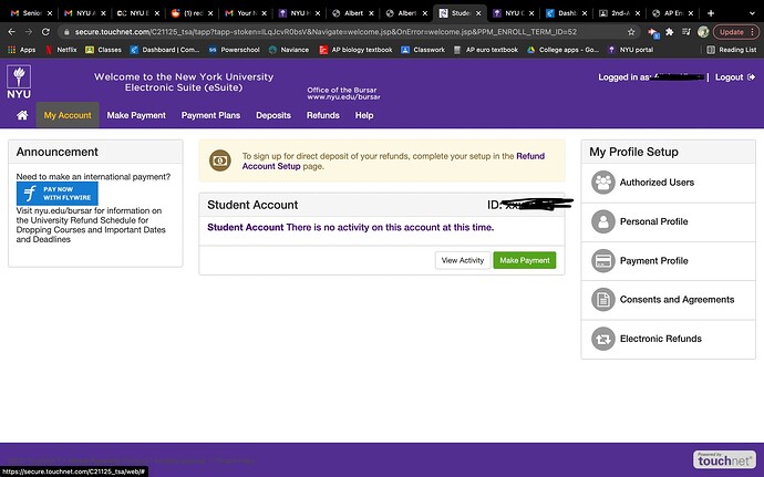
I only heard of two situations:
2buttons+summer
or
1button+no app
yes i dont think the button means anything except your decision Is in the system
I have this too. In my j term drop down, I see NYU and AD.
And I have waitlist undergrad under academic year 2021-22 and spring 2022.
Do you see similar in yours?
Did anyone go from having 2 buttons to 1 button?
I did
Fr its stressing me out even more lmao
wait there are ppl with no stern email has one button and no apps?? I thought ppl with email has one button and no apps
Wait, i applied to stern and have 2 boxes and summer 2022. My email doesn’t exist, but i also put alternate programs. Is there an indicator for alternate programs?
did u do a summer program?
There’s also this thing that if you look at callibra international data center and go to NETID, it says that its accepted for me and im signed in to the thing
Applied but wasn’t able to attend.
When did you go from 2 to 1?
where do you get to this data center thing?
nah it says accepted for everyone
check reddit
I went from 2 to 1 sometime this week maybe around wednesday or thursday
Hopefully the buttons change this week!
I believe that the one button only means that the decision in your case has been made. The positive indicator would then be the email working.
one button means ur decison is made, two means not made or differed or wait list, email with one app possibly means acceptence, no email one button possibly means rejection
I read somewhere about 50% of students admitted through ED1 and ED2, with slightly more from ED1.

